Camilla Marie Dahl - The Way Home
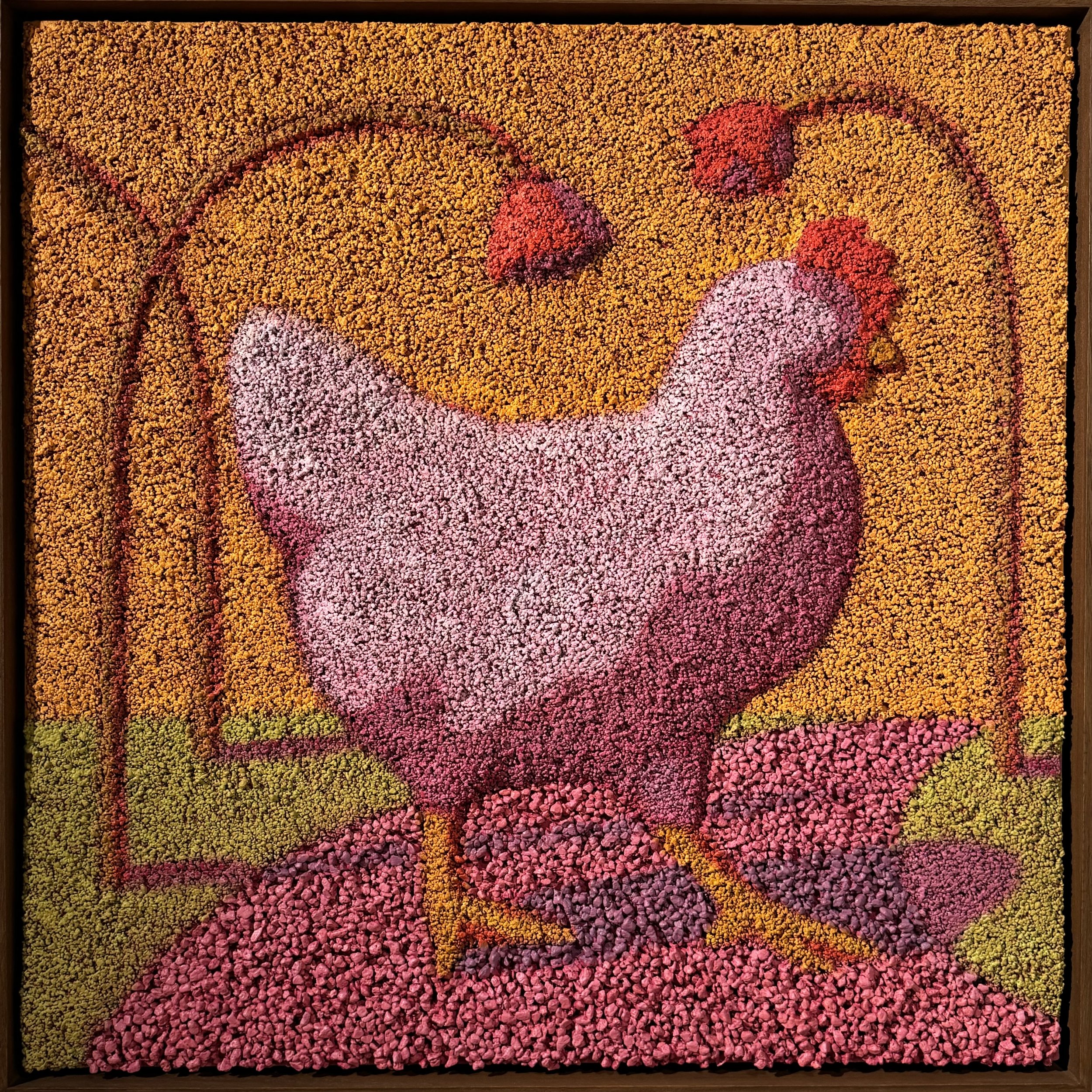
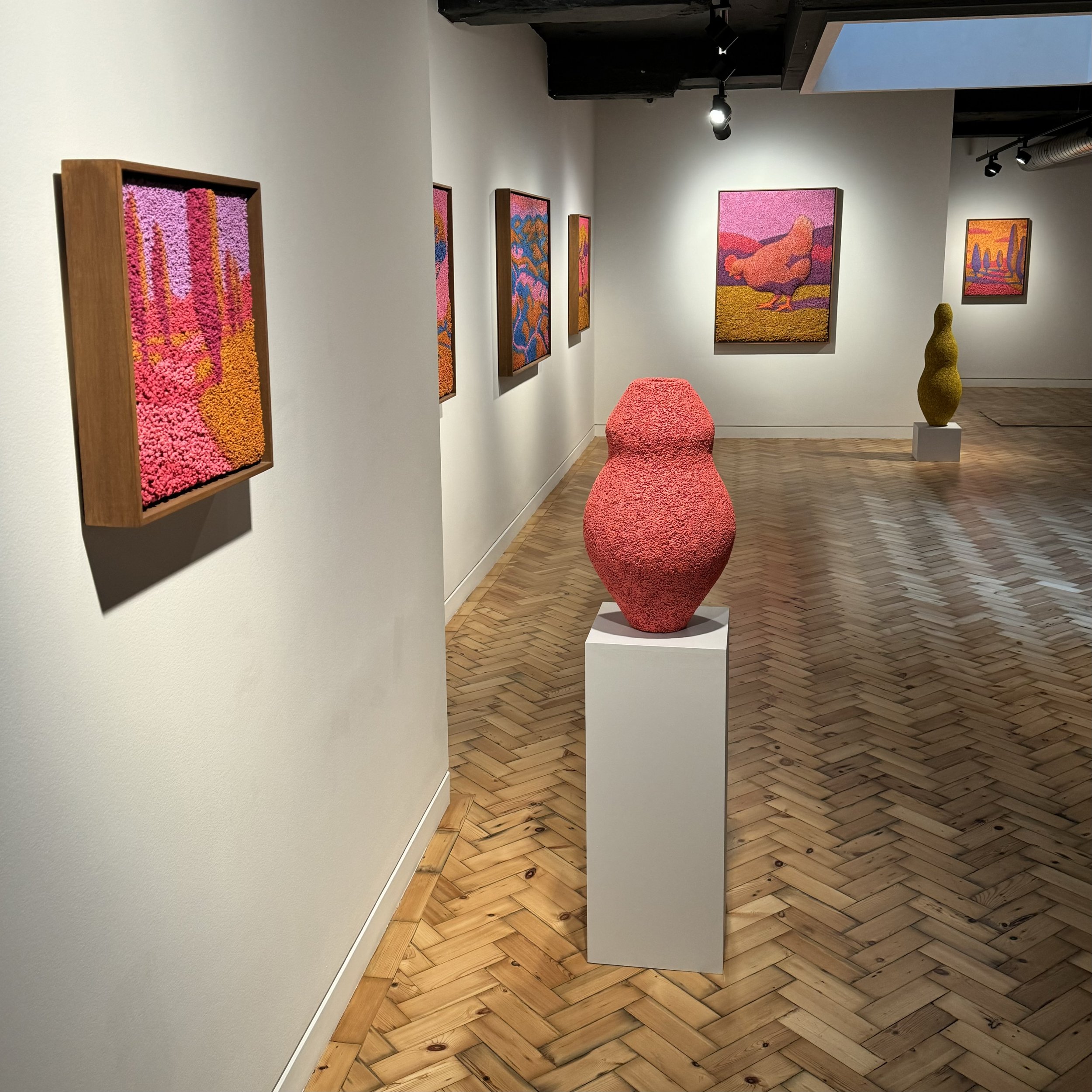
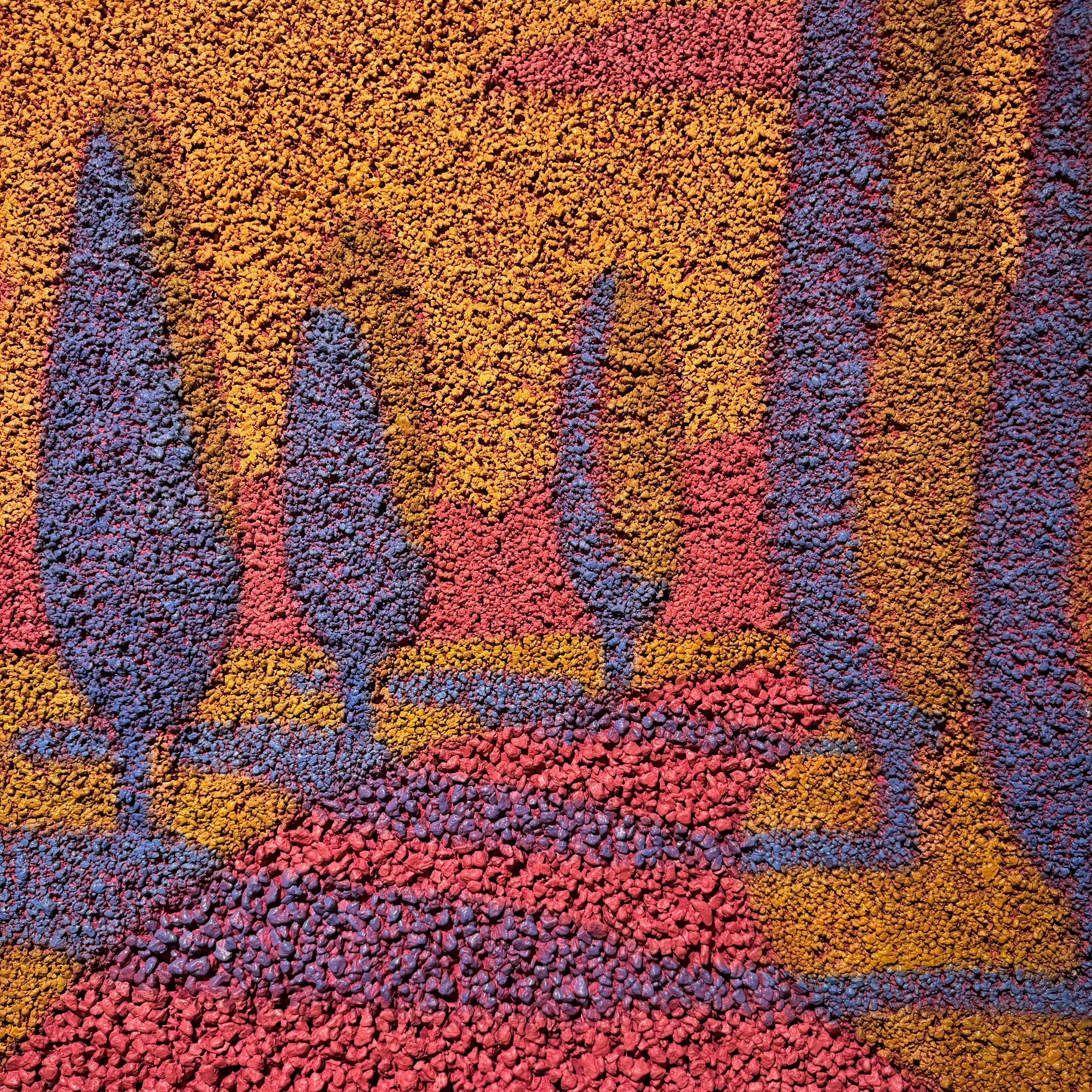
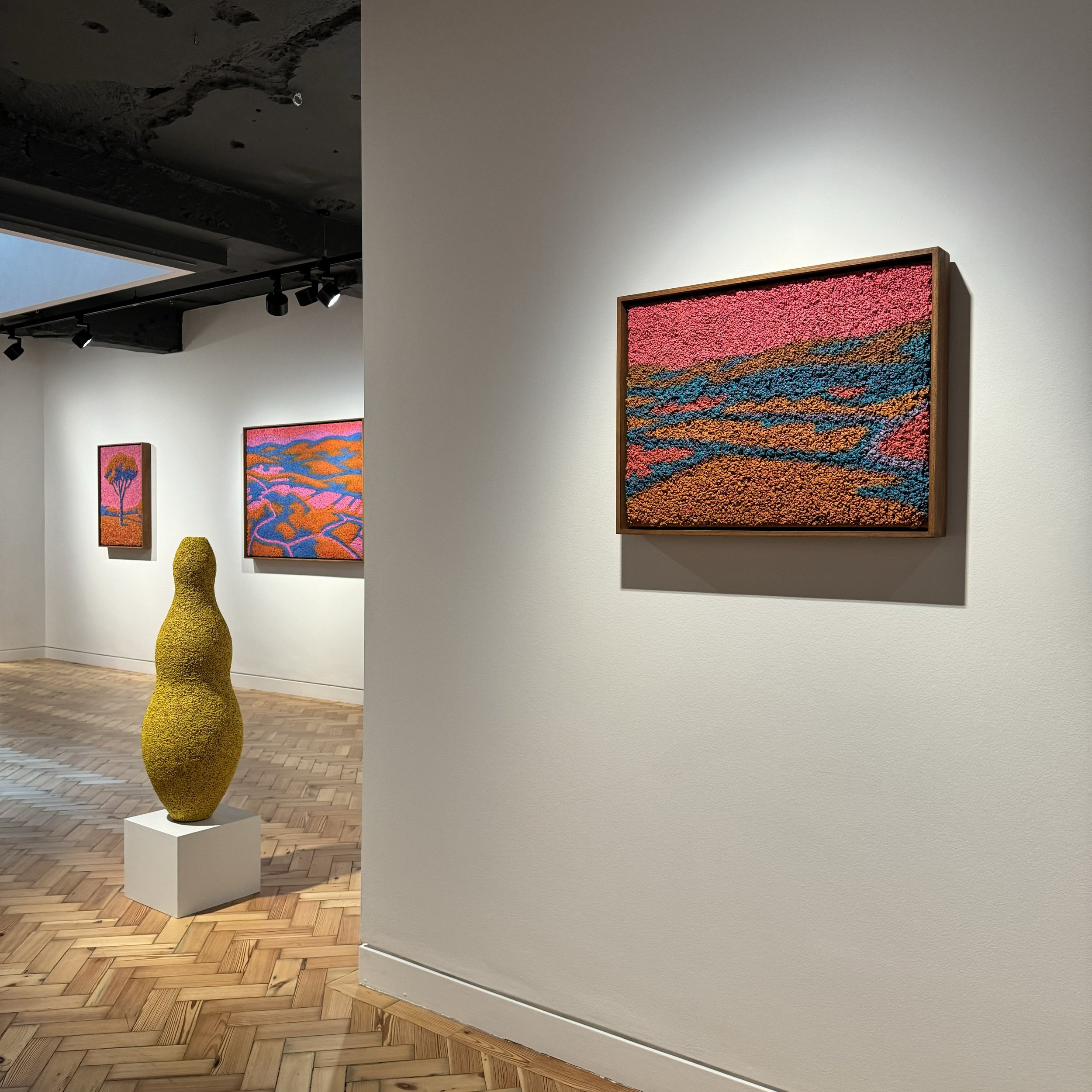
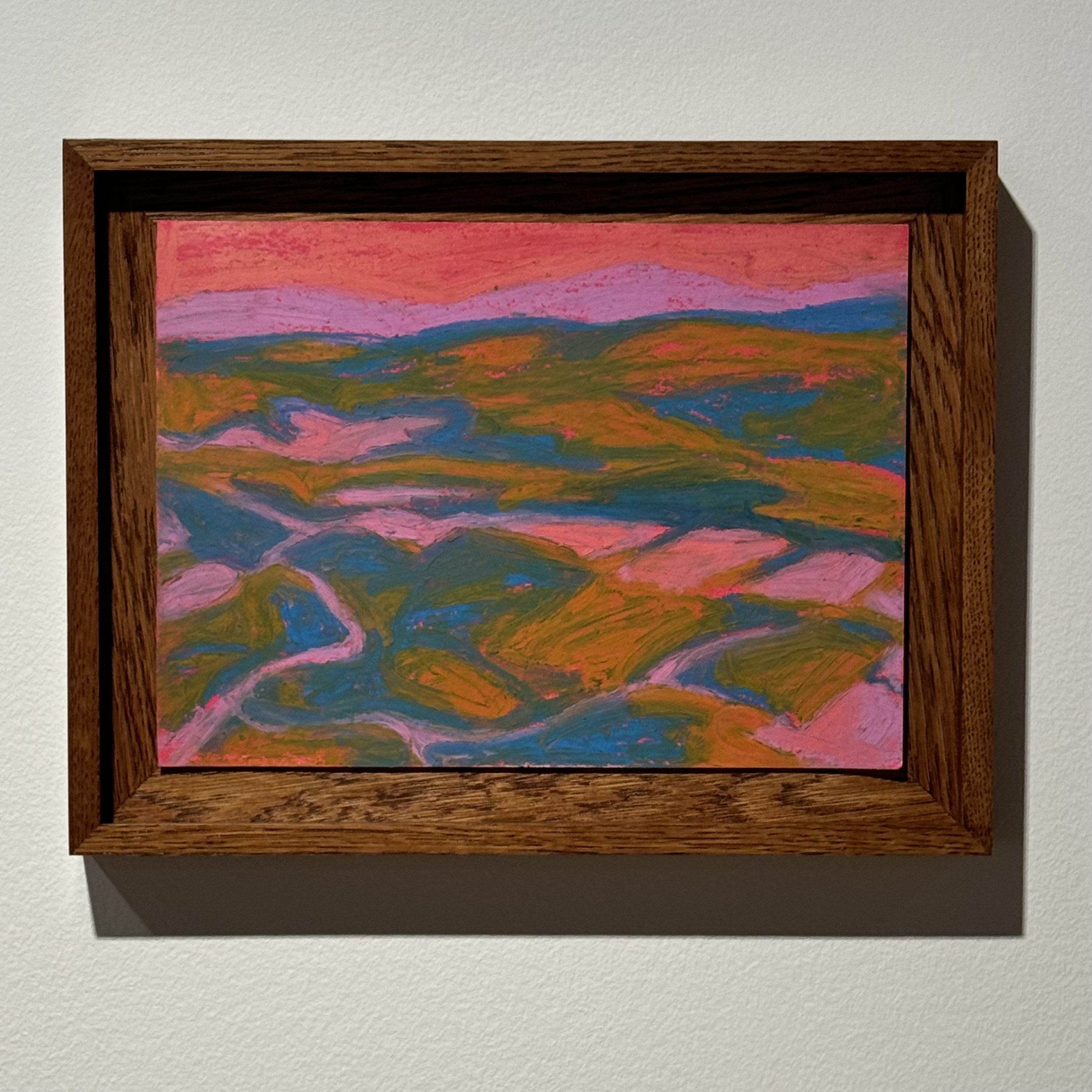
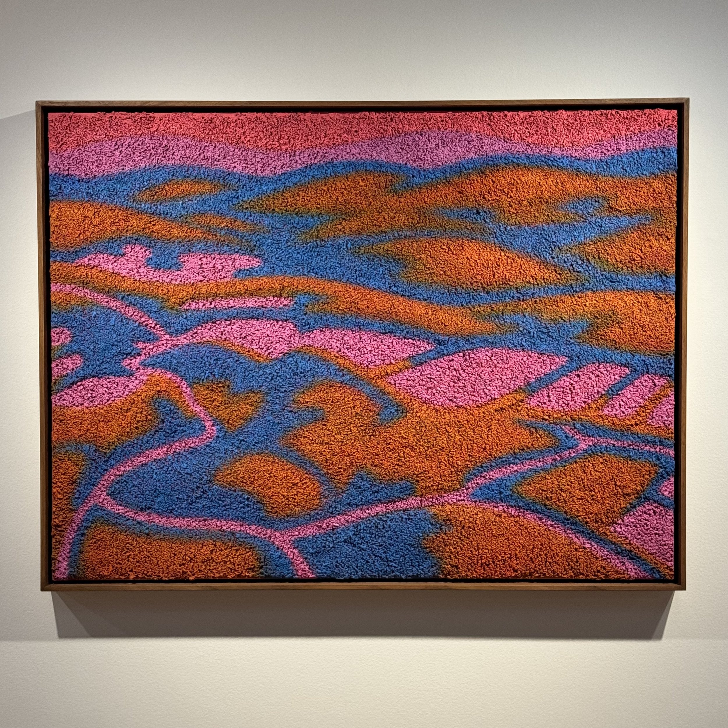
One of, if not the, most important reasons for art to exist is the power that it has to impact our emotions. There are many ways this can be achieved, but one that I always find fascinating is an artist’s ability to do it not just with an image but through the materials they use. I was recently reminded of this when I encountered the latest series of paintings by Camilla Marie Dahl. They relaxed me in the way a country retreat relaxes me. When there’s nothing to do except watch the evening sunlight hit the horizon and listen to the sounds of nature.
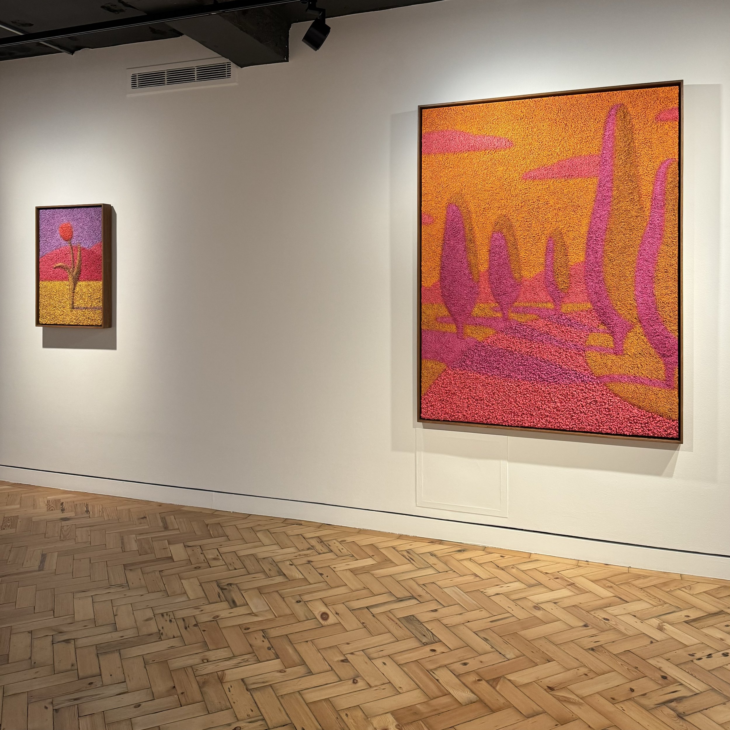
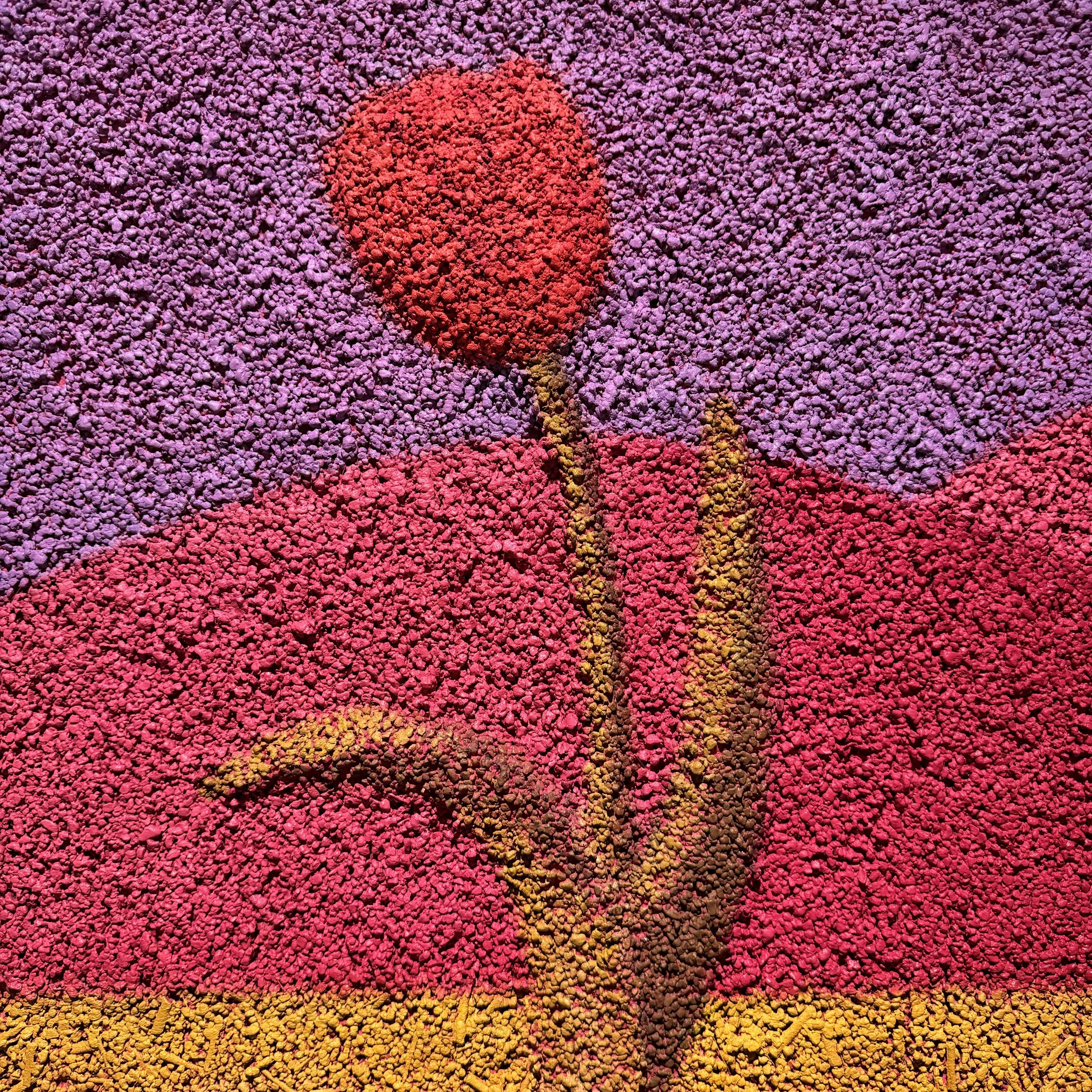
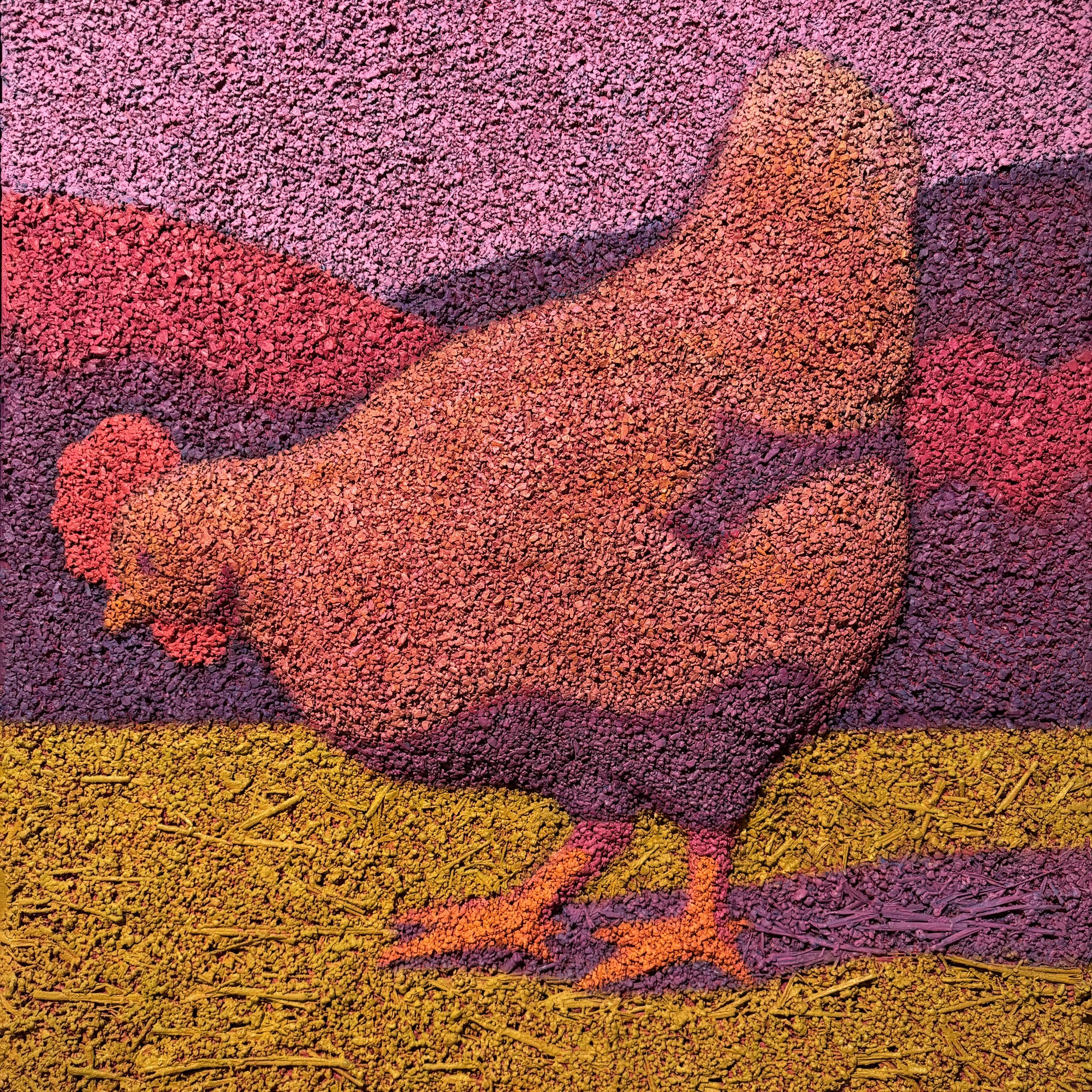
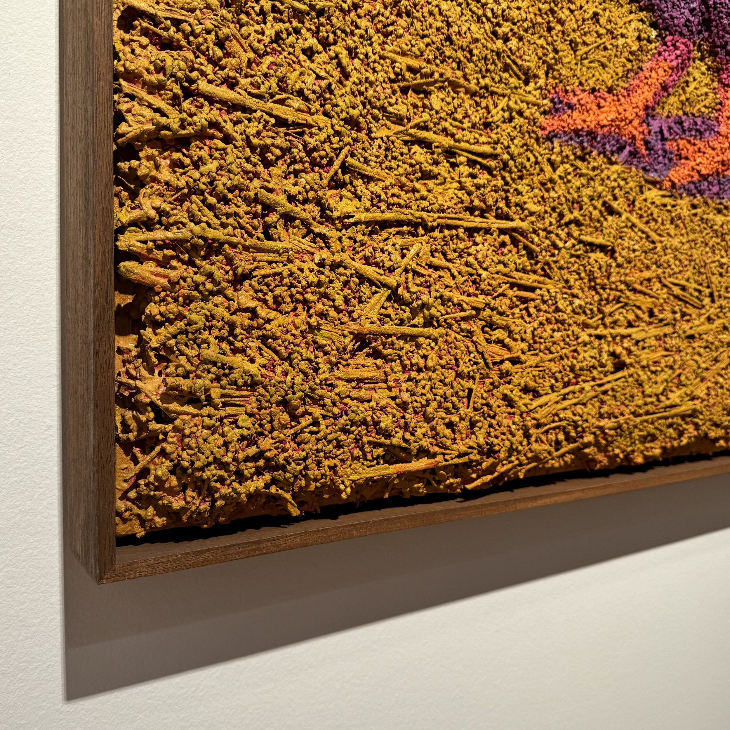
Dahl’s images are pared back compositions. A chicken. A single flower. Three small trees along a road. Each contains only a few elements and their shadows, rendered in solid colours in a way that would be considered pop art if these were canvas or paper. Except pop-art can be cold, whereas Dahl’s scenes trigger warm emotions because in the same way that a wooden Nordic sauna has an entirely different feel than a marble tiled bathroom, Dahl’s canvasses are not cloth but layers of organic materials. They have a distinct tactile effect that is occasionally punctuated by bumps and bulges that give the illusion that some of the elements are rising out of the image like the top of a warm baked muffin.
Notice the inclusion of hay in the chicken portraits. It’s as if a shovel of ground from a farmyard has been scooped up and carefully layered into the frame. Dahl wisely lets the materiality carry the weight, probably knowing full well that these visuals, had they been rendered as oil on canvas or lino-cut, might bear little interest. Some may argue that this type of effect is a gimmick, but those who can’t fully appreciate the impact of materiality need only compare the largest work in the show to it’s much smaller, oil on card study.
Both versions of “The Way Home” show, from a high vantage point, a road meandering through sprawling hillsides. The smaller work is no different than countless similar scenes painted throughout the centuries. Which is to say, somewhat boring and uninspired. It’s worth repeating that this smaller work is a study. Regardless, compositions like this rarely hold attention and even then only when stylised with a distinctive visual flair.
Now look at the Dahl’s larger finished version, four times the size and visually almost identical in composition and colour. This one pops. The distinctive hard edges that separate the colours help clarify the scene. There is a heightened sense of perspective but the graphic, illustrative style teases the eye, making you think that it might actually be an abstract. It’s a highly visually engaging work, but ultimately it is the use of pumice that draws you close and grounds you, no pun intended, into the landscape.
When I entered the gallery and glanced at the visuals I didn’t expect to be taken in by depictions of chickens and purple shadows of shrubbery. But like water seeping into a porous floor I was quickly drawn into Dahl’s scenes, which are inspired by her Spanish countryside home. I hadn’t planned an August getaway, but seeing these works made me feel like I’d just come back from one.
Plan your visit
‘The Way Home’ runs until 11 August.
Visit unitlondon.com and follow @unitlondon on Instagram for more info about the venue.
Visit camillamariedahl.com and follow @camillamariedahl on Instagram for more info about the artist.
PLUS…
Check the What’s On page so you don’t miss any other great shows closing soon.
Subscribe to the Weekly Newsletter. (It’s FREE!)
