V&A Rotunda Chandelier (2001)
Dale Chihuly (b.1941)
V&A Rotunda Chandelier, 2001
Blown glass, mould-blown glass, steel
27 feet × 12 feet (widest)
Victoria & Albert Museum
The concept of the ‘lone genius’ is frequently applied to art. It’s an easy way to oversimplify the credit for what is often a complex production process, but it’s also frequently used as inspiration. It’s much more heroic for an aspiring artist to day-dream that it’s their name on the wall plaque as opposed to being one of the many forgotten assistants that contributed a small but essential part. And though it’s impossible to look at some works and seriously consider that the entire process from thought to finished installation was the effort of a sole individual, names like Dale Chihuly frequently walk away with that accolade. Except that’s not how he ever intended things to be.
Chihuly was blinded in his left eye as a result of a car crash in 1976, and in most photos of him ever since he is seen wearing a black eye patch. He also suffered permanent damage to his right foot and ankle, and three years later a shoulder dislocation. His physical injuries ended the ability to maintain complete hands-on autonomy of his work but they clearly didn’t impact his creative vision. He built and became reliant on a trusted studio team to produce his work and as he said unironically in a 2006 interview, "Once I stepped back, I liked the view."
Chihuly’s studio is now world famous, with permanent installations in major museums and prominent public locations all over the globe. The ambition of the work has grown significantly over the last four decades and despite mastering a variety of techniques and motifs the works are instantly recognisable. If you’ve seen one Chihuly you’ll easily spot another, with styles that are iconic and frequently copied. The phrase “Chihuly Chandelier” is now a commonly used descriptor on mail-order lighting websites.
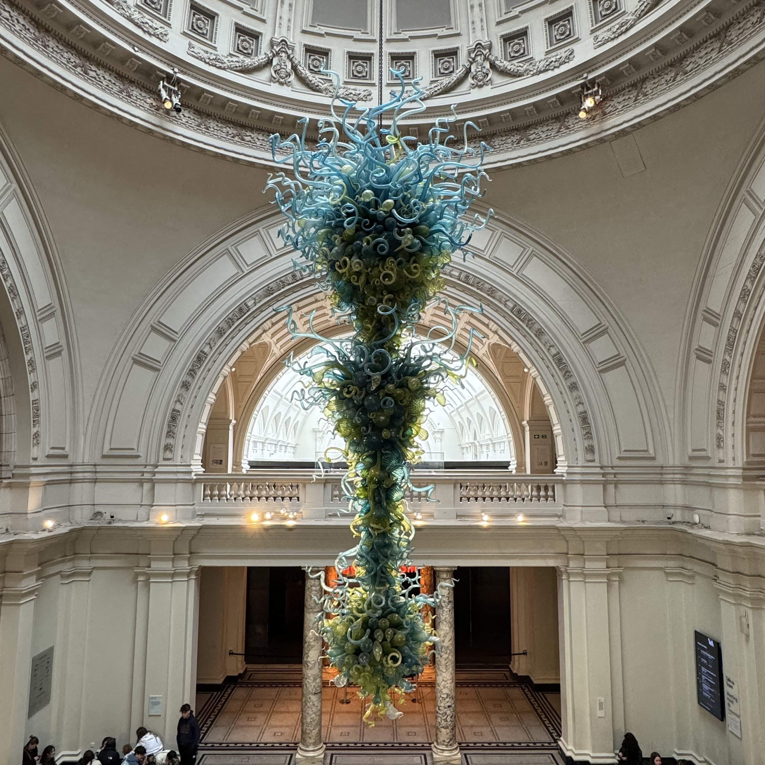
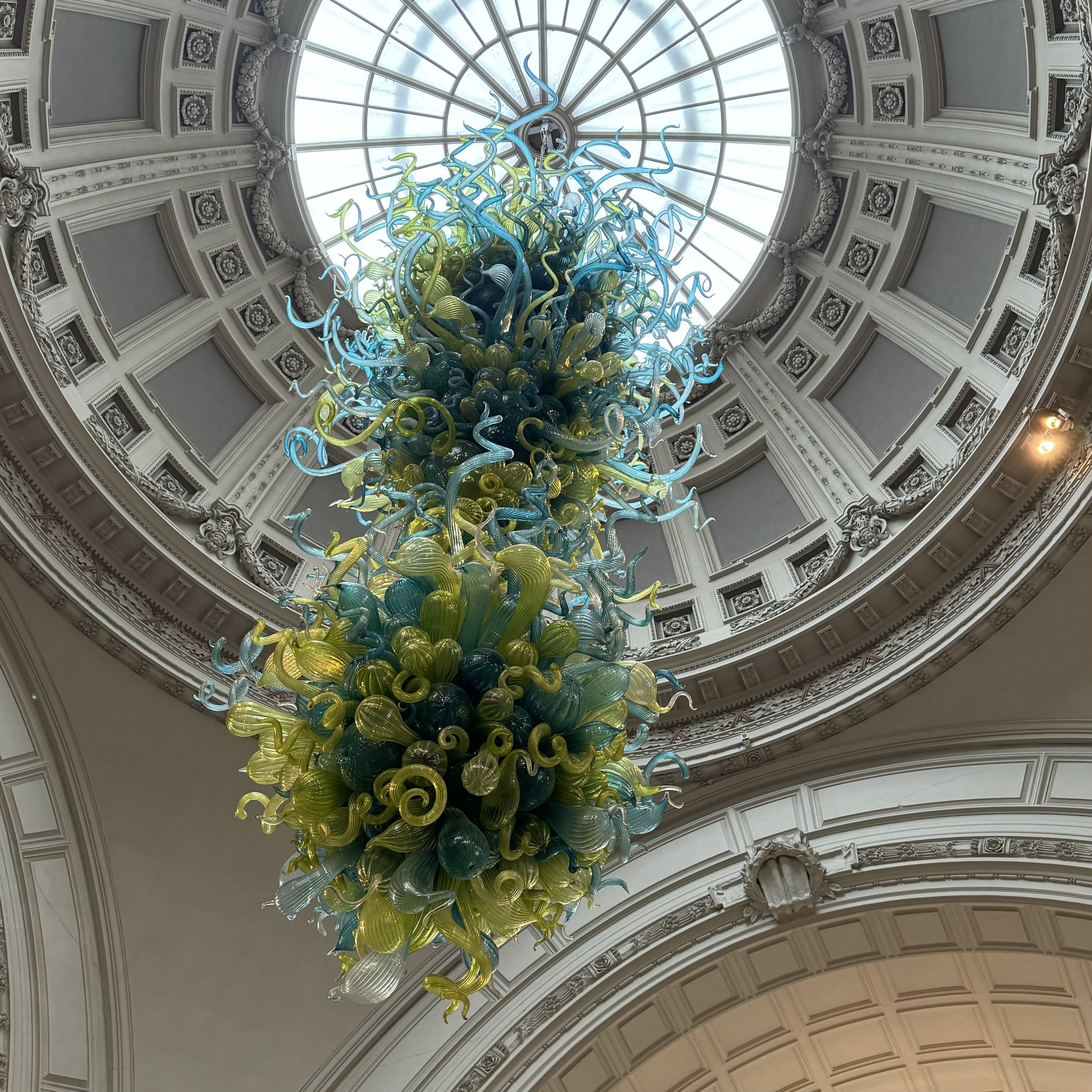
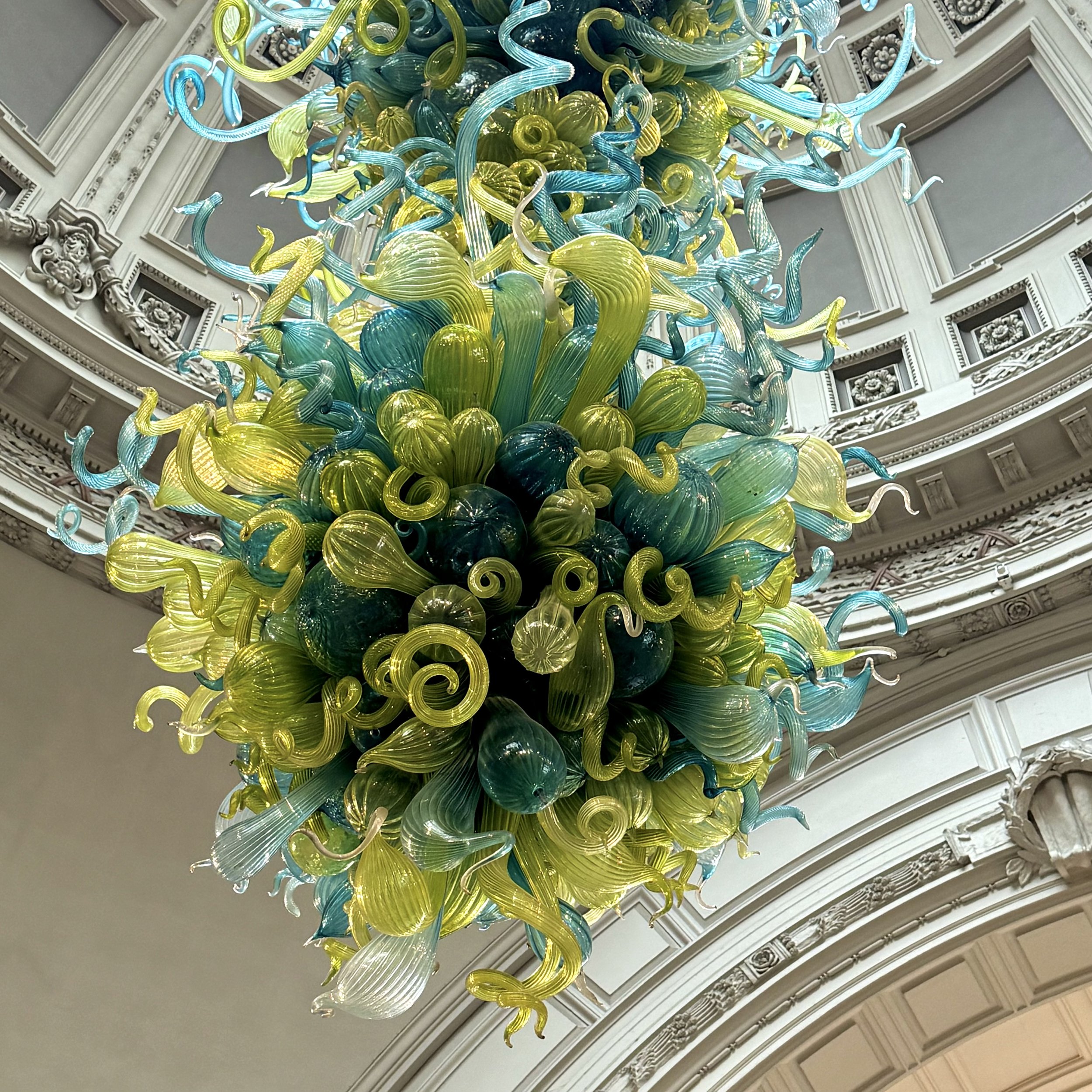
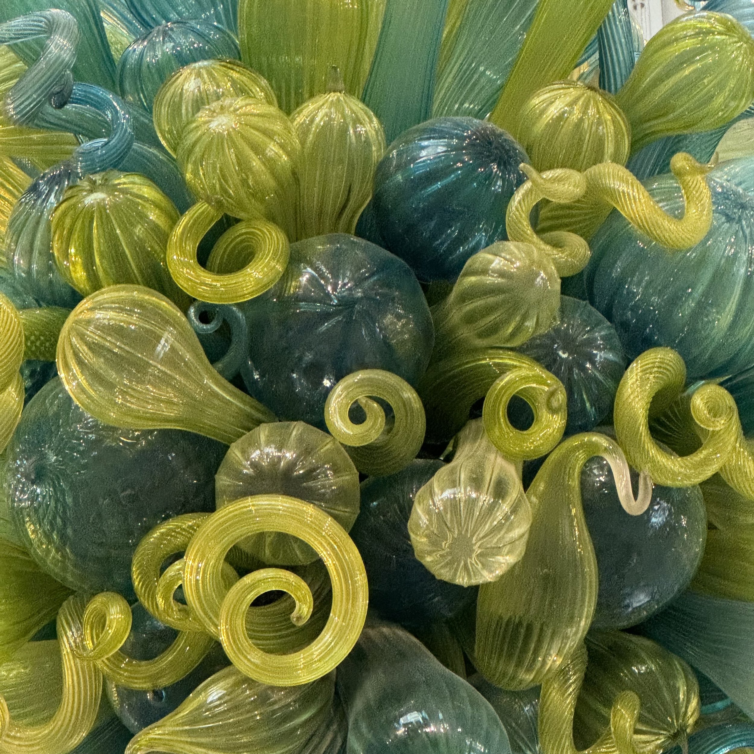
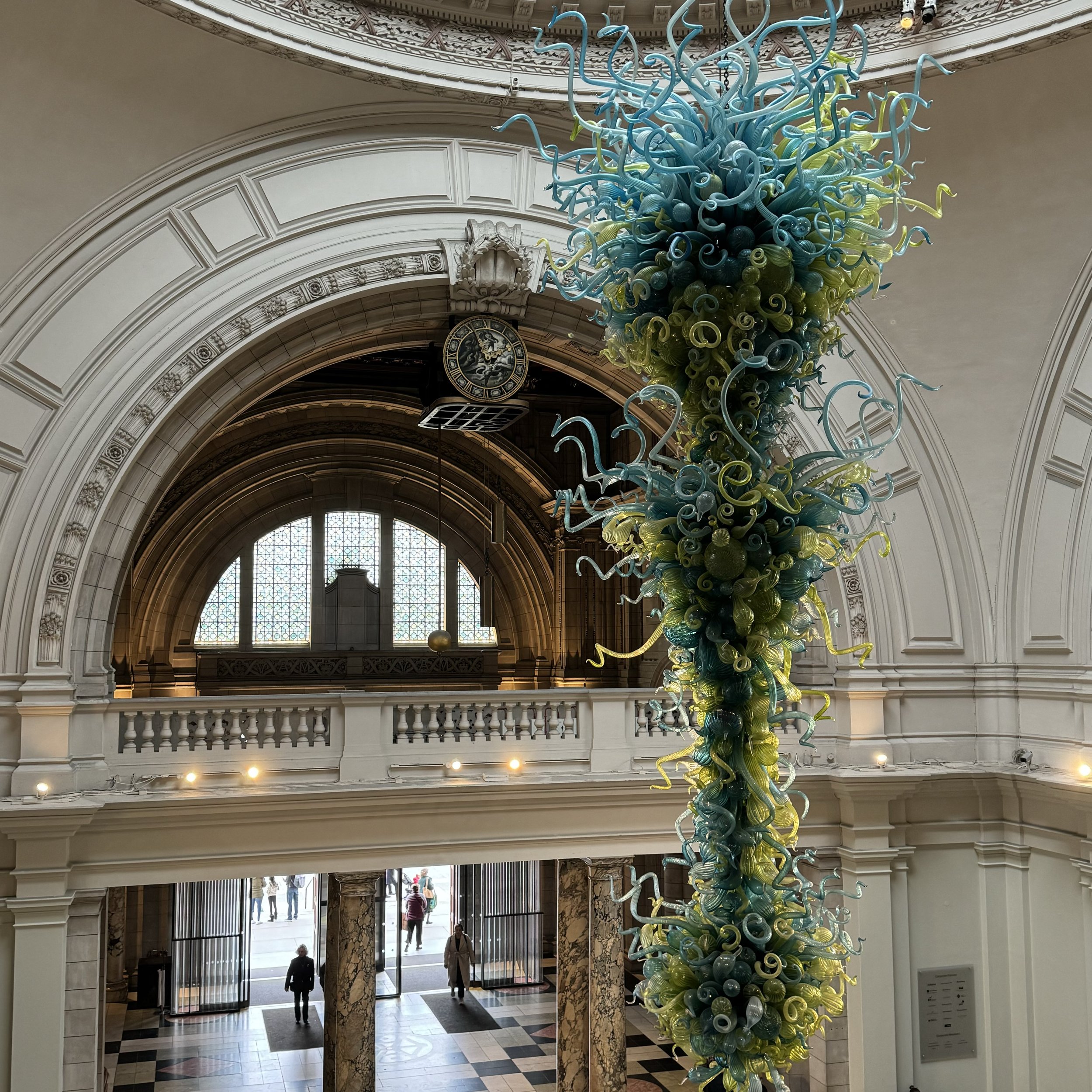
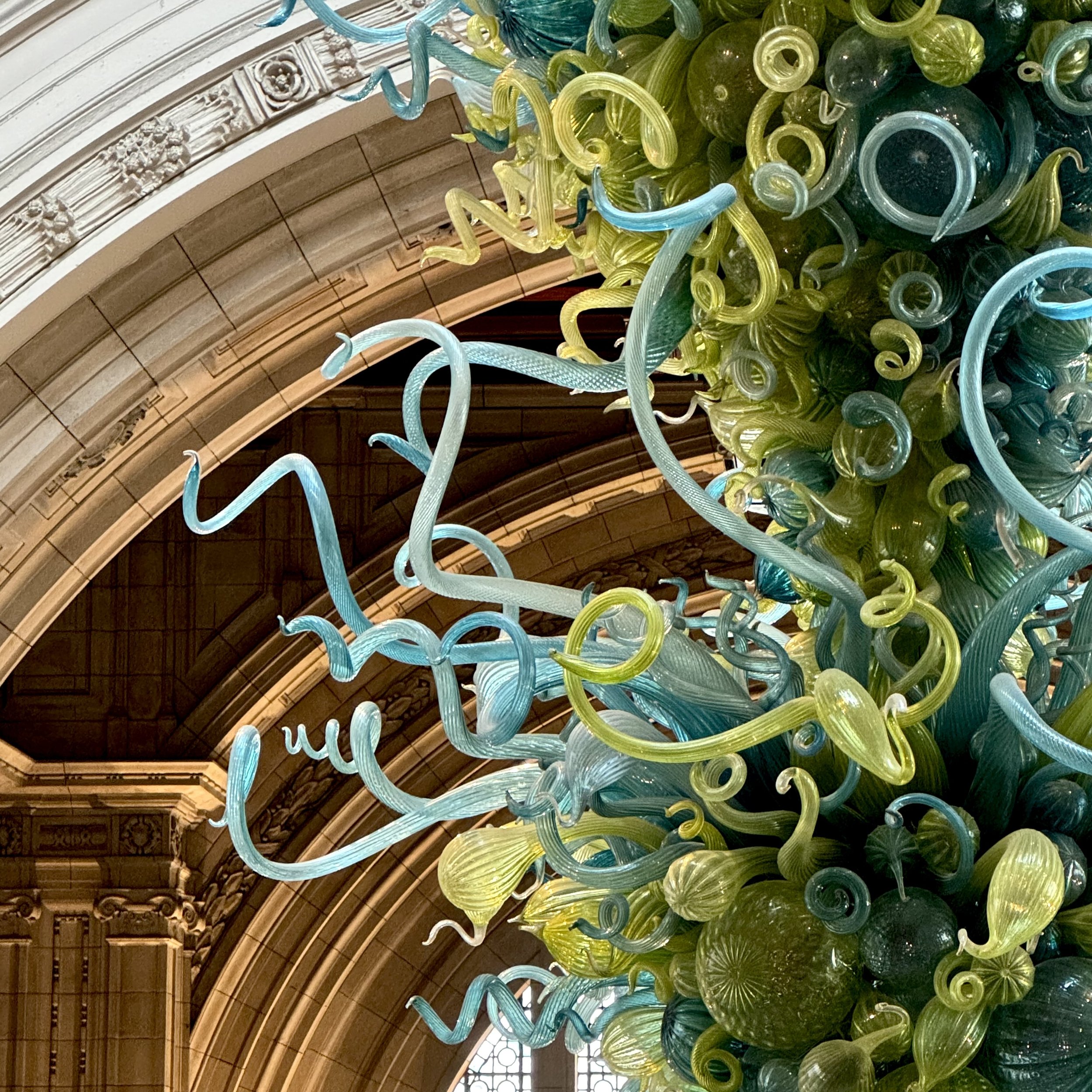
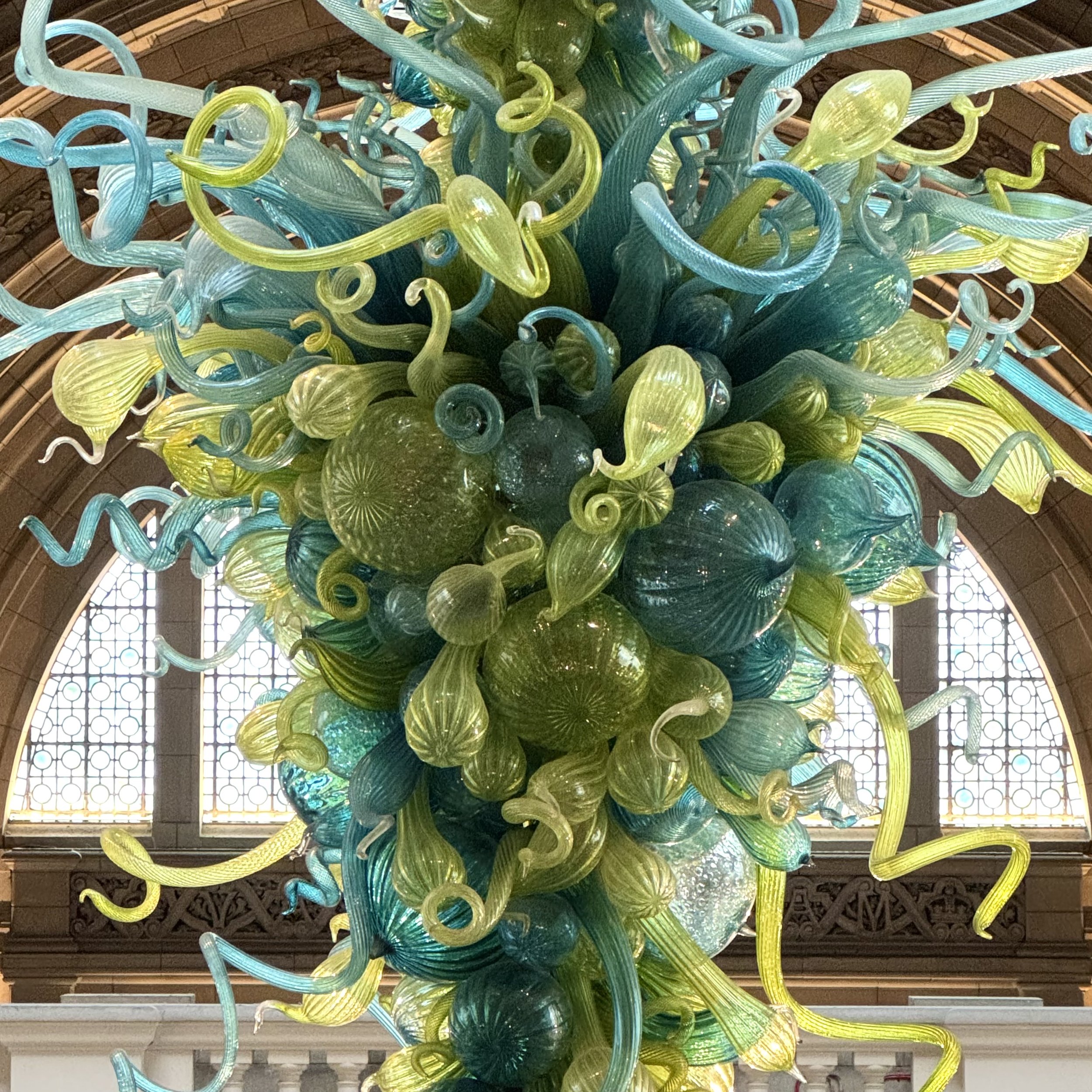
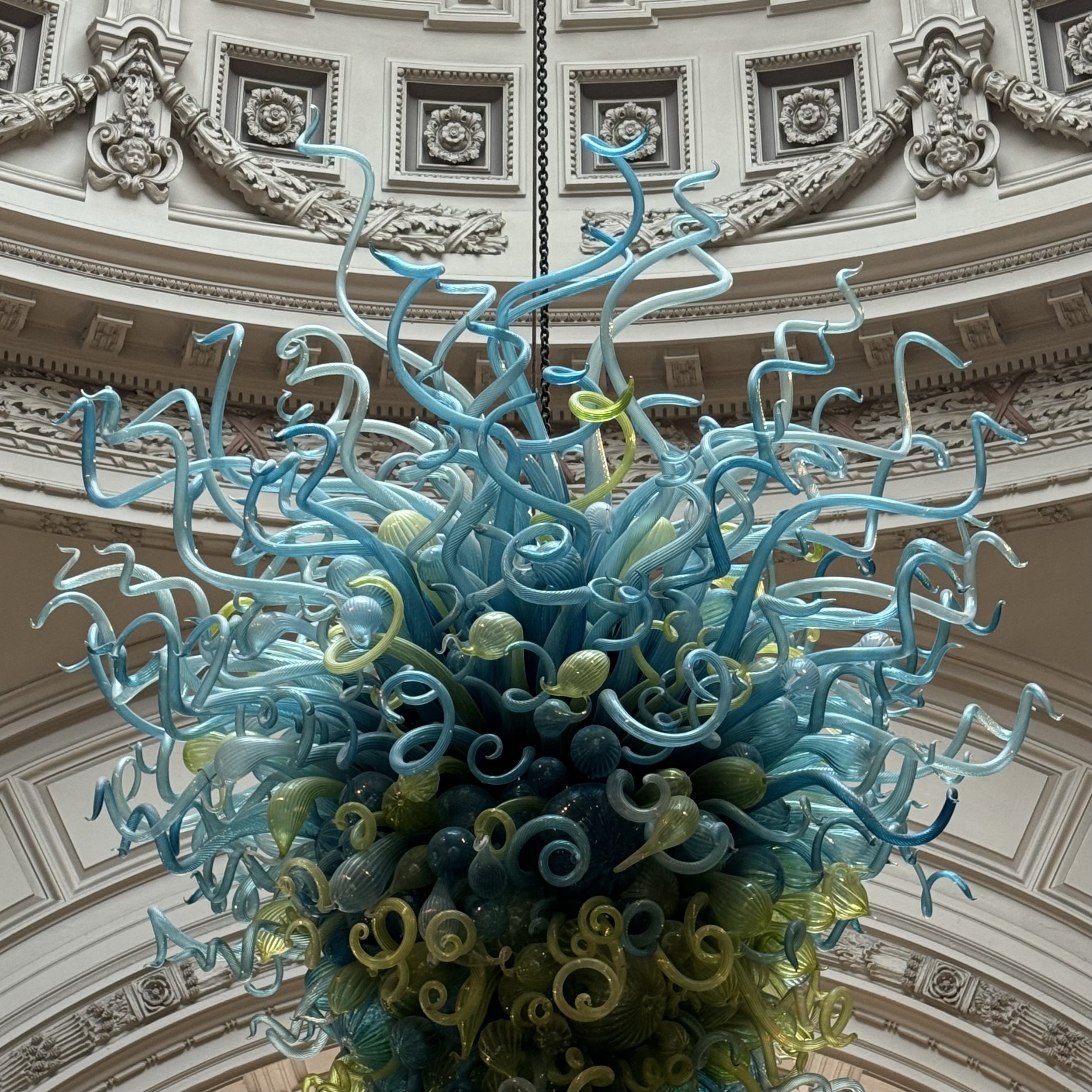
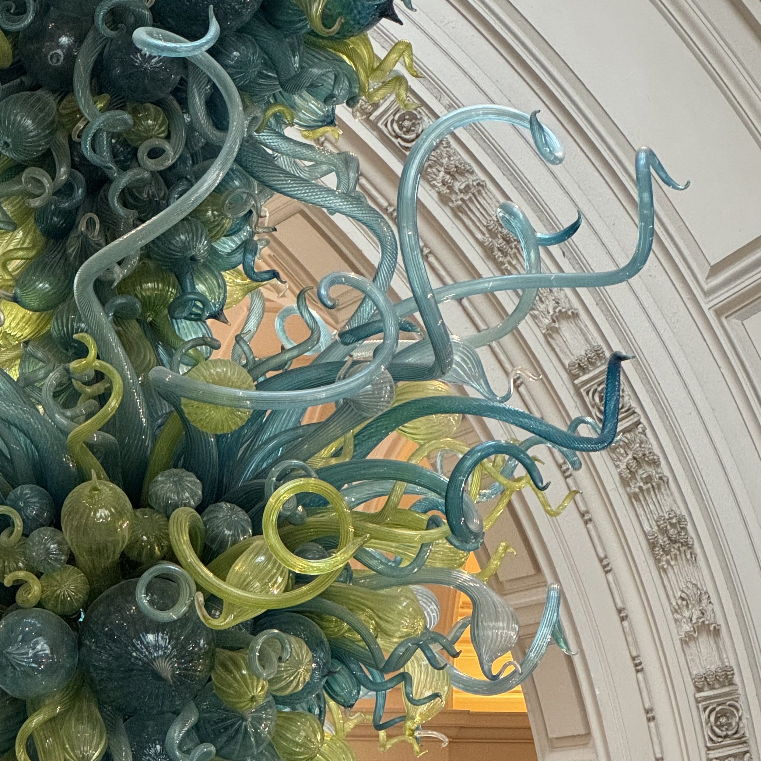
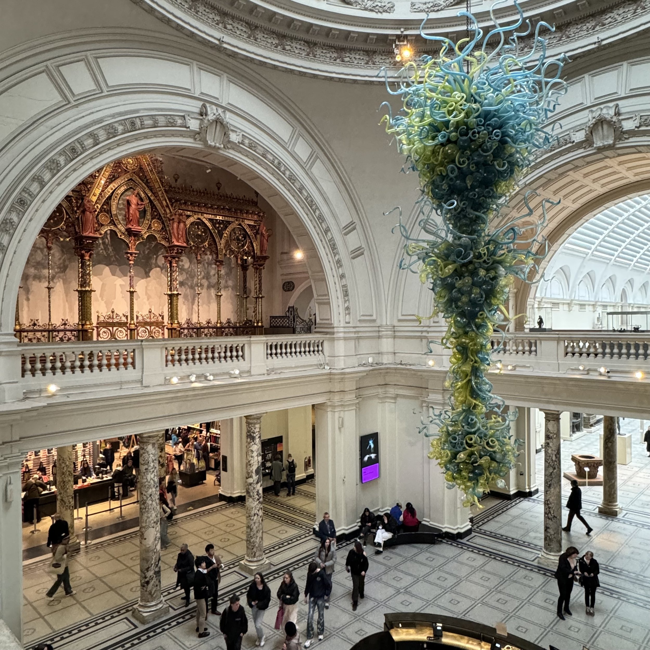
The work in the V&A atrium is part of the ‘Chandelier’ series, which Chihuly began in 1992. It was custom designed for the space and contains either 1,400 or 2,000 components. (The V&A’s website contradicts their wall text.) If the light hits the jumbled mix of semi-transparent blue and yellow bulbs just right you might think you see a thicket of green hued gourds. Hung in the centre of the main atrium, it floats high above the ticket & membership desk. I wonder if the staff who sit there ever look up at the slim, gesticulating forms that look like balloons that party clowns use and think “It can’t be that heavy, can it?” Yes, it can. It weighs 1,724 kilos (3,800 lbs or 1.9 US ton) and no, I wouldn’t want to sit underneath it all day either.
It was a cloudy, overcast day when I took my photos so the colours may look a bit faded but then again, the shapes are made of glass. The way they catch the light plays a large part in how they appear. If you make your way up to the balcony you can stand in alignment with the spotlights so they backlight the spine to give you a more richly coloured view of the wavy, chaotic shapes that distinctly stand out from the rest of the classical, white-domed atrium. A more considered study will reveal plenty of things that align them to the space, notably the rampant floral motifs and wreaths that line the base of the rotunda within which it is hung.
It’s 27 feet tall and 12 feet across at it’s widest. Even if you know nothing about glass blowing or chandelier construction you can certainly appreciate the intricacy and skill required to put this thing together. It took a team of six a whole week to individually wire the elements — some of which are 5 feet long! — into the steel spine from which they extrude. In my opinion, it is the perfect welcoming artwork to a museum that champions design, creativity and production excellence in all its forms. It’s also utterly useless.
It’s not a light, and it doesn’t do anything. It is pure, decorative art. And although the V&A has a wide range of functional items in its collection of 2.8 million objects, it’s the ones that aren’t intended to do anything other than amuse and delight that remind us about the joys of life, and that life is indeed to be enjoyed. Together.
That’s why I like it.
It takes a village.
Previously, on Why I Like It:
Mar — Brass Snooker Chalk (2023), George Richardson
Feb — The Identi-Kit Man (1962), Derek Boshier
Jan — Miami Mountain (2016), Ugo Rondinone

